If you're new to Python
and VPython: Introduction
A VPython tutorial
Pictures of 3D objects
Widgets:
button,
|
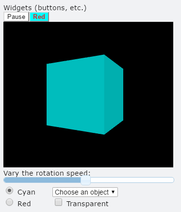 |
Tthe example shown above, ButtonsSlidersMenus-VPython, contains buttons, a slider, radio buttons, a drop-down menu, and a check box. The example program Color-RGB-HSV-VPython uses six sliders to explore RGB and HSV colors. The winput object lets the user enter a numeric expression or text. The wtext object (widget text) isn't interactive like a button or slider but is often used together with other widgets. It provides a way to modify dynamically a portion of the title or caption of a canvas, perhaps in response to interactions with other widgets.
Here is the basic idea for using button, radio buttion, checkbox, slider, menu, and winput:
box()
def B(b):
print("The button said this: ", b.text)
button( bind=B, text='Click me!' )
scene.append_to_caption('\n\n')
def R(r):
print(r.checked) # alternates
radio(bind=R, text='Run') # text to right of button
scene.append_to_caption('\n\n')
def C(r):
print(r.checked) # alternates
checkbox(bind=C, text='Run') # text to right of checkbox
scene.append_to_caption('\n\n')
def S(s):
print(s.value)
slider( bind=S )
scene.append_to_caption('\n\n')
def M(m):
print(m.selected, m.index)
menu( choices=['cat', 'dog', 'horse'], bind=M )
scene.append_to_caption('\n\n')
def T(s):
print(s.text, s.number)
winput( bind=T )
By default, widgets are appended to scene.caption_anchor, below the canvas. The append_to_caption statements above cause the radio button to appear below the button, the checkbox to appear below the radio button, the slider to appear below the checkbox, and the dropdown menu to appear below the slider. If you specify pos=scene.title_anchor, the widget will appear above the canvas.
The function specified by "bind" is called when the user clicks a button or radio button or checkbox, drags a slider, chooses a menu option, or enters a numeric expression or string in a winput box. The function is sent a pointer to the widget, which lets you reference or change information about the widget. For the radio button and checkbox, the (optional) text is placed one space to the right of the widget.
Important limitation of GlowScript VPython: The bound function cannot contain the statements rate, sleep, pause, waitfor, get_library, or read_local_file, statements that require pausing during execution. This limitation does not apply to VPython 7.
Adding your own attributes
As with other objects, you can add your own attributes to those listed below. For example, you might have three buttons all bound to the same function but with different attributes "id=1", "id=2", and "id=3". When the function is called by the user clicking the button, you could decide what to do based on the value of the "id" attribute you created.
button
A space is placed to the right of the button, so that there is always some space between a button and an adjacent widget. Here are the attributes of a button widget:
pos Position to which to append the widget (see "Appending to anchor points" below). Cannot be changed after creating the button.
text The text shown on the button. Can be changed at any time. The text can contain html directives. For example '<b>Run</b>' will display 'Run' in bold.
color The color of the text shown on the button. Can be changed at any time.
background The background color of the button. Can be changed at any time.
bind The name of the function to be called when the button is clicked. Cannot be changed after creating the button.
disabled If True, the button text is grayed out and the button is inactive. Can be changed at any time.
delete() If B is a button, B.delete() deletes the button from the display.
radio
Radio buttons are often used in a group of two or more, in which you arrange that only one is checked at any time. Here are the attributes of a radio widget (a radio button):
pos Position to which to append the widget (see "Appending to anchor points" below). Cannot be changed after creating the radio button.
text The text shown one space to the right of the radio button. Can be changed at any time. The text can contain html directives. For example '<b>Run</b>' will display 'Run' in bold. You may wish to add some spaces to the end of the text to separate the text from an adjacent widget.
bind The name of the function to be called when the radio button is clicked. Cannot be changed after creating the radio button.
checked If True, the radio button is highlighted; default is False. Can be changed at any time.
disabled If True, the radio button is grayed out and the radio button is inactive. Can be changed at any time.
delete() If R is a radio button, R.delete() deletes the radio button from the display.
checkbox
Here are the attributes of a checkbox widget:
pos Position to which to append the widget (see "Appending to anchor points" below). Cannot be changed after creating the checkbox.
text The text shown one space to the right of the checkbox. Can be changed at any time. The text can contain html directives. For example '<b>Run</b>' will display 'Run' in bold. You may wish to add some spaces to the end of the text to separate the text from an adjacent widget.
bind The name of the function to be called when the checkbox is clicked. Cannot be changed after creating the checkbox.
checked If True, the checkbox is highlighted; default is False. Can be changed at any time.
disabled If True, the checkbox is grayed out and the checkbox is inactive. Can be changed at any time.
delete() If C is a checkbox, C.delete() deletes the checkbox from the display.
slider
Here are the attributes of a slider widget:
pos Position to which to append the widget (see "Appending to anchor points" below). Cannot be changed after creating the slider.
vertical If True, the slider is vertical, otherwise the slider is horizontal (the default). Cannot be changed after creating the slider.
bind The name of the function to be called when the slider is changed. Cannot be changed after creating the button.
min The minimum value of the slider; default is 0. Cannot be changed after creating the slider.
max The maximum value of the slider; default is 1. Cannot be changed after creating the slider.
step The step size when clicking or dragging. The default is 0.001*(max-min). Cannot be changed after creating the slider.
value The current value (between min and max) of the slider. Can be set by program as well as by user motions. When you set the value by program (slider.value = something), the bind function is NOT executed, which prevents confusion that would arise in situations such as the RGB-HSV demo program, where a user change in a slider causes program changes to the values of other sliders.
length The length of the slider, whether vertical or horizontal; default is 400 (pixels). Cannot be changed after creating the slider.
width The width of the slider, whether vertical or horizontal; default is 10 (pixels). Cannot be changed after creating the slider.
left Margin to the left of the slider; default is 0 (pixels). Cannot be changed after creating the slider.
right Margin to the right of the slider; default is 0 (pixels). Cannot be changed after creating the slider.
top Margin above the slider; default is 0 (pixels). Cannot be changed after creating the slider.
bottom Margin below the slider; default is 0 (pixels). Cannot be changed after creating the slider. Currently does not seem to work properly.
align If 'left' (the default), the slider is displayed at the left of the window; if 'right', the slider is displayed at the right of the window. Cannot be changed after creating the slider.
disabled If True, moving the slider does not create an event. Can be changed at any time.
delete() If S is a slider, S.delete() deletes the slider from the display.
menu
A space is placed to the right of the menu, so that there is always some space between a menu and an adjacent widget. Here are the attributes of a menu widget:
pos Position to which to append the widget (see "Appending to anchor points" below). Cannot be changed after creating the menu.
choices A list of strings to appear on the menu, such as ['cat', 'dog', 'horse']. Cannot be changed after creating the menu.
selected The chosen string, such as 'dog'. Can be set by program as well as by user choice.
index The position of the chosen string in the choices list, starting from zero. Can be set by program as well as by user choice.
bind The name of the function to be called when a menu item is chosen. Cannot be changed after creating the menu.
disabled If True, the menu is grayed out and the menu is inactive. Can be changed at any time.
delete() If M is a menu, M.delete() deletes the menu from the display.
winput
The winput object (widget input) displays a box in which the user can input a numeric expression or text. The user must select the text either by clicking in the box or by using the tab key.
pos Position to which to append the widget (see "Appending to anchor points" below). Cannot be changed after creating the object.
bind The name of the function to be called when the user presses Enter. Cannot be changed after creating the object.
type "numeric" (the default) or "string". If it is numeric, the user can input expressions such as 3+2*sqrt(5.2e4). An error message is displayed if there is something wrong with the expression, and the bound function is not called. Cannot be changed after creating the object.
width The width of the winput box in pixels; default is 100. Cannot be changed after creating the object.
height The height of the winput box in pixels; default is 20. Cannot be changed after creating the object.
text The text displayed in the box, whether entered by the user or set by the program (for example, one might wish to set the text to be displayed before the user enters anything, which the user can modify).
number The number that results from evaluating the user's input text if the type is "numeric" (otherwise it is None). If a numeric winput object is named W and the user enters 3+5, then W.text will be the string "3+5" and W.number will be 8.
disabled If True, the text is grayed out and the winput is inactive.
delete() If W is a winput, W.delete() deletes the winput box from the display.
wtext
The wtext object (widget text) isn't interactive like a button or slider but is often used together with other widgets. It provides a way to modify dynamically a portion of the title or caption of a canvas, perhaps in response to interactions with other widgets.
pos Position to which to append the widget (see "Appending to anchor points" below). Cannot be changed after creating the wtext object.
text The text shown at the specified place. Can be changed at any time. The text can contain html directives. For example '<b>Run</b>' will display 'Run' in bold. You may wish to add some spaces to the start or end of the text to separate the text from an adjacent widget. The text need not be a string; it will be converted to a string for display.
delete() If W is a wtext, W.delete() deletes the wtext from the display. An alternative is to set the text to "", which leaves the wtext in place but without displaying anything.
Appending to anchor points
VPython provides three anchor points that can be used to append widgets to the page, by specifying the widget's pos attribute as one of these anchor points:
scene.title_anchor
scene.caption_anchor
print_anchor
Specifying print_anchor adds a widget to the bottom of the web page, where the print area is.
Positioning widgets
When you create a widget it is appended to the anchor point. As explained above, a space is placed after button and menu widgets to separate them. If you want more space between them, and they are in the caption, execute scene.append_to_caption(' ') between the creations of the buttons. In the case of checkbox and radio widgets, you can increase the space between it and an adjacent widget simply by adding extra spaces to the end of the checkbox or radio text.
If you want to provide a margin of 20 pixels between adjacent vertical sliders, one method is to set left=20 for all but the leftmost slider.
To provide vertical spacing between widgets in the caption, execute something like scene.append_to_caption('\n\n') between the creations of the widgets. The string "\n" represents a new line (a "carriage return").