If you're new to Python
and VPython see more
Help at glowscript.org
Pictures of 3D objects
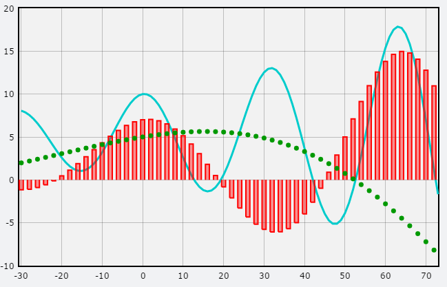
In this section we describe features for plotting graphs with tick marks and labels as shown above. Graphs can be log-log or semilog (see below). As you drag the mouse across the graph you will find options to read information off the graph.
A graph is different from a canvas: a canvas is inherently 3D and contains 3D objects such as spheres and boxes, whereas a graph is inherently 2D and contains graphing objects for displaying curves, dots, and vertical or horizontal bars.
New capabilities introduced with GlowScript VPython 2.7
You can now choose between two graphing packages, one which is faster, which is the one used in previous versions (currently based on Flot), or one which offers rich interactive capabilities such as zooming and panning but is slower (currently based on Plotly). The default is the fast version, corresponding to specifying fast=True in a graph, gcurve, gdots, gvbars, or ghbars statement. To use the slower but more interactive version, say fast=False. In many programs the "slow" version may run nearly as fast as the "fast" version, but if you plot a large number of data points the speed difference can be significant.
Both versions offer new capabilities: If you specify markers=True when creating a gcurve object, dots will be displayed at each gcurve point, and you can specify marker_radius (the default is slightly larger than the gcurve width) and marker_color (the default is the gcurve color). For a graphing object you can specify label="cos(x)" and this text, in the color of the object, will appear at the upper right. If you say legend=False the label is not actually shown. The dot (see below) and label options need to be specified when you create the graphing object.
If you can, do try fast=False to see the many options provided. As you drag the mouse across the graph with the mouse button up, you are shown the numerical values of the plotted points. You can drag with the mouse button down to select a region of the graph, and the selected region then fills the graph. As you drag just below the graph you can pan left and right, and if you drag along the left edge of the graph you can pan up and down. As you move the mouse you'll notice that there are many options at the upper right. Hover over each of the options for a brief description. The "home" icon restores the display you saw before zooming or panning. Try this demo.
The basics
Here is a simple example of how to plot a 2D graph (arange creates a numeric array running from 0 to 8, stopping short of 8.1):
f1 = gcurve(color=color.cyan) # a graphics curve
for x in arange(0, 8.05, 0.1): # x goes from 0 to 8
f1.plot(pos=(x,5*cos(2*x)*exp(-0.2*x))) # plot
A connected curve (gcurve) is one of several kinds of graph plotting objects. Other options are disconnected dots (gdots), gvbars), and horizontal bars (ghbars).
When creating gcurve, gdots, gvbars, or ghbars, you can optionally give a list of data points and/or a color (if no color is specified, the plotting color will be black):
f1 = gcurve(data=[ [1,2],[5,-2],[8,4] ],
color=color.green)
After creating one of these graphing objects, you can add a single point or a list of additional points (for backward compatibility, you can say "pos" instead of "data"):
f1.plot(data=[100,-30]) # add a single point
f1.plot(data=[[100,-30], [20,50], [0,-10]]) # add a list
You do not need to specify "data=" when adding points. Here are other permissible formats:
f1.plot(1,2)
f1.plot([1,2])
f1.plot([1,2], [3,4], [5,6])
f1.plot([ [1,2], [3,4], [5,6] ])
Once you have created a graphing object such as gcurve, its initial color will be used throughout. You can change the color later, but this will change the color of all the elements already plotted.
You can plot more than one thing on the same graph:
f1 = gcurve(color=color.cyan)
f2 = gvbars(delta=0.05, color=color.blue)
for x in arange(0., 8.05, 0.1):
f1.plot(x,5*cos(2*x)*exp(-0.2*x) # gcurve
f2.plot(x,4*cos(0.5*x)*exp(-0.1*x)# vbars
You can replace all of the points in a gcurve, gdots, gvbars, or ghbars object like this:
f1.data = [ [10,20], [30,40], [50,60] ]
This is equivalent to deleting all the points from the graph and then adding the new ones.
It is often the case that skipping points may hardly affect the display but will make graph plotting much faster, in which case it's useful to specify an interval between plotting of points:
interval If interval=10, a point is added to the plot only every 10th time you ask to add a point. If interval is 0, no plot is shown. If interval is -1, no points are skipped.
Special options for gcurve, gdots, gvbars, and ghbars
For gcurve you can specify a width of the line in pixels. If you specify markers=True, dots will be displayed at each gcurve point, and you can specify the radius (the default is slightlly larger than the gcurve width) and marker_color (the default is the gcurve color). Instead of setting the radius, you can set size, which sets the diameter (equivalent to 2*radius).
If you
specify dot=True the current plotting
point is highlighted with a dot, which is particularly useful if
a graph retraces its path. You can specify a dot_radius attribute,
which specifies the radius of the dot in pixels (default is radius=3).
By default the dot has the same color as the gcurve, but you can
specify a different color, as in dot_color=color.green.
For gdots you can also specify a radius or size attribute, which specifies the radius or diameter of the dot in pixels (default is radius=3).
For gvbars and ghbars you can specify a delta attribute, which specifies the width of the bar (the default is delta=1).
Deleting data or an entire graph
If you create a gcurve, gdots, gvbars, or ghbars entity and name it g, you can delete the associated data from a graph by saying g.delete(). Similarly, if you say gd = graph(), you can delete the entire graph by saying gd.delete().
Overall graph options
You can establish a graph to set the size, position, and title for the title bar of the graph window, specify titles for the x and y axes, specify maximum values for each axis, and set foreground and background colors, before creating gcurve or other kind of graph plotting object:
gd = graph(width=600, height=150,
title='<b>Test</b>',
xtitle='<i>x</i>', ytitle='<i>x</i><sup>2</sup>',
foreground=color.black,
background=color.white,
xmin=-20, xmax=50, ymin=-2e3,
ymax=5e3)
Setting limits: In this example, the graph window will have a size of 600 by 150 pixels, and above the graph there will be a centered bold title "Test". The x and y axes of the graph will have the labels. x and x2. The foreground color is black (the default), and the background color is white (the default).
Instead of autoscaling the graph to display all the data, the graph in this example will have fixed limits. The horizontal axis will extend from -20 to +50. If you specify xmax but not xmin, it is as though you had also specified xmin to be 0; similarly, if you specify xmin but not xmax, xmax will be 0. The same rule holds for ymax and ymin. When using fast=False, you must specify both xmin and xmax (except that xmin will be set to zero if only xmax is specified), and you must specify both ymin and ymax (except that ymin will be set to zero if only ymax is specified),
Titles: For title, xtitle, and ytitle you can give a number or numerical expression, which will be converted to a string.You can include the HTML styles for italic (<i> or <em>), bold (<b> or <strong>), superscript (<sup>), or subscript (<sub>). For example, the string
"The <b>mass <i>M</i></b><sub>sys</sub> = 10<sup>3</sup> kg."
displays as
The mass Msys = 103 kg.
Multiple lines in a title can be displayed by inserting line breaks (\n), as in "Three\nlines\nof
text" and you can insert <br> or <br/> instead of \n. You cannot use line breaks in xtitle or ytitle. If a title is specified, the height of the graph is increased to provide space for the title.
If you simply say graph(), the defaults are width=640, height=400, no titles, fully autoscaled.
You can align a graph to the left or right of another graph or a canvas:
align Set to "left" (graph forced to left side of window), "right" (graph forced to right side of window), or "none" (the default alignment). If you want to place a graph to the right of a canvas, set the canvas align attribute to the string "left" and the graph align attribute to the string "right". If the window is too narrow, the object that is on the right will be displayed below the other object. If you want to place a graph to the right of the canvas but keep the canvas caption underneath the canvas, create the graph first with align set to "right", then create the canvas without specifying its value of align.
You can have more than one graph window: just create another graph. By default, any graphing objects created following a graph belong to that window, or you can specify which window a new object belongs to:
energy = gdots(graph=graph2, color=color.blue)
You can also obtain the current graph with graph.get_selected(), and you can set the current graph to be the graph named gd by executing gd.select().
Here is a summary of what determines in which of several possible 2D graphs a graphing object such as a gcurve or gdots will be placed:
g1 = graph() # default properties
gcurve(...) # will appear in the graph named "g1"
gdots(graph=g1, ...) # will also appear in "g1"
g2 = graph(width=200,height=100,title='A second graph')
gcurve(...) # will appear in the graph named "g2"
gdots(graph=g2, ...) # will also appear in "g2"
gvbars(graph=g1, ...) # will appear in "g1"
The key point is that after creating a graph, 2D objects will by default be placed in the most recently created graph, unless you explicitly specify a different graph for the object.
Log-log and semilog plots
When creating a graph, you can specify logarithmic plots by specifying logx=True and/or logy=True. All values must be positive, representing logarithms of numbers between infinitely small (logarithm approaches 0) and infinitely large; that is, numbers such as 0.01, 0.1, 1, 10, 100, etc.
Histograms (sorted, binned data)
There is no ghistogram option. However, the program HardSphereGas provides an example of how to make a histogram.